top of page
Debra Parkington
Corporate identity design
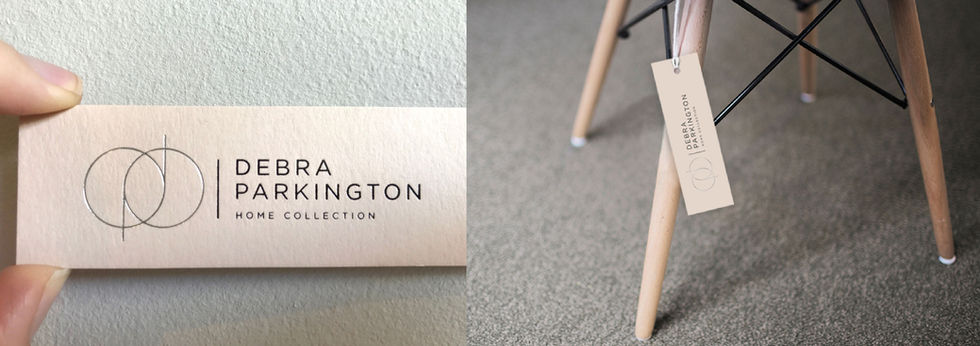
Debra Parkington is an upmarket home collection and furniture brand. The brief was to create an identity that is simple and iconic, and also reflects luxury and quality. An icon was created with a lowercase 'd' and 'p' that is made out of 2 perfect circles and 2 straight lines that overlap. The overlapping circles reference sacred geometry, which teaches us that the “living substance, ever expanding into limitless space, proceeds according to the principles of geometry and proportion". The Debra Parkington brand sees geometry and proportion as an integral part of their design ethic. The overall result of the identity is that of unique simplicity, refined elegance and sophistication.

bottom of page


